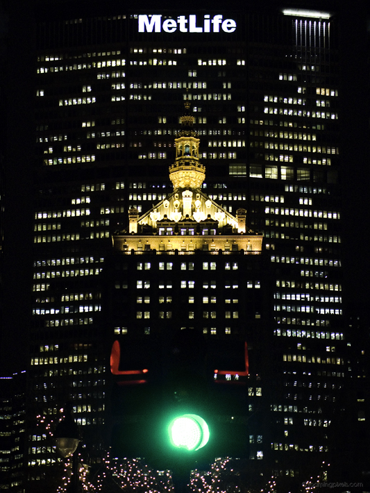
The fact that this is the MetLife building is really rather secondary in this instance. Sure, it’s a cool building, but there are surely many better images of it out there.
Instead, there were other things that intrigued me here. The green for “go,” in context to my previous post, for example. Another thing is the near symmetry…things are just a bit off, and don’t quite line up, which makes it more interesting to me.